News
[Blog] Skins for the MistServer Meta-player
Hi there!
In January 2019 we released MistServer 2.15, which included our reworked meta-player: a player that selects the best streaming protocol and player for the used stream and browser. New in this rework is just how much it can be customised - change just a few colours, add your logo or completely overhaul the look and feel: everything is possible.
In this post I, Carina, would like to highlight a few of these skinning capabilities.
I will assume you already have some knowledge of how to embed the player on your page, and of how HTML, Javascript and CSS works.
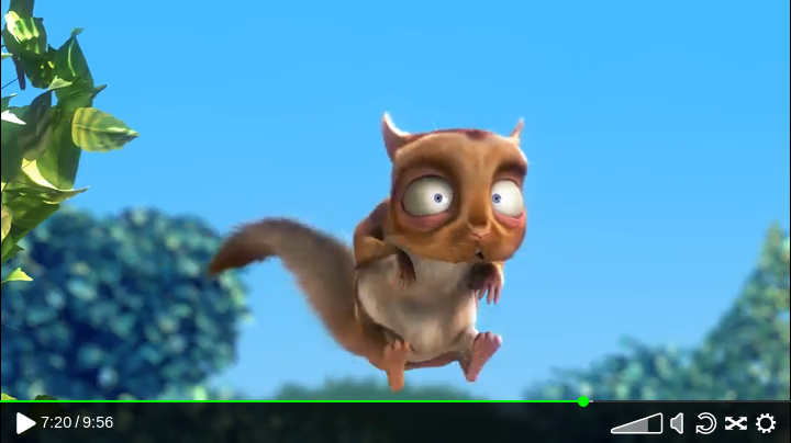
Let's transform the appearance of the meta-player from its default look of this:
..to this:
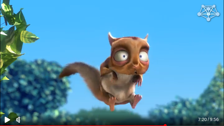
I'll take you through the steps one by one, so that you'll be able to use what you want for your own project.
You can find the files I used for this example here.
The basics
So, how do we change the way the player looks? Well, the bit of Javascript that builds the player, mistPlay(), accepts options, and one of those is the skin option.
You can read more about all the possibilities in our manual in chapter 5.4.
The entire skin can be defined in the options that are given to mistPlay(), or it can be defined elsewhere and the skin name can be passed to mistPlay() instead. It'll look something like this:
mistPlay(streamname,{
  skin: {
    colors: { accent: "red"; }
  }
});
or
MistSkins.custom = {
  colors: { accent: "red"; }
};
mistPlay(streamname,{
  skin: "custom"
});
The key thing to remember when defining a skin is that your settings are parsed as changes to the default skin. That means you don't have to build everything from scratch, you can just change what you'd like to see differently. Should you want to base your work on another skin, you can specify it like this:
MistSkins.even_more_custom = {
  inherit: "custom"
}
1) Change a colour
Let's start small.
Suppose I have this awesome website, and I've used red accents to spice things up or highlight certain features. Wouldn't it be nice if the player also used this same colour?
We could change other colours too, but they are more neutral so let's leave those alone.
The skin object would become:
MistSkins.step1 = {
  colors: {
    accent: "red"
  }
};
Of course, you don't have to use a named colour. You can use any colour definition that CSS would understand.
Now, the player looks like this:

2) Add a CSS rule
The default skin has a rather pronounced background. Say we'd like to see something more subtle. What about a gradient? That'd be pretty cool right?
If we use the web inspector to inspect the control bar, we can see that the element with class mistvideo-main has the background colour. That means we should probably add a CSS rule to override it.
CSS rules for a skin are taken from a file. This is how you add a new one:
MistSkins.step2 = {
  inherit: "step1",
  css: { custom: "myskin.css" }
};
The file itself can contain pure CSS, but it can also have variables, marked with a dollar sign. These are replaced with the values that are defined within the colors object. (We don't use CSS variables because they are not supported in older browsers that the player does need to support)
To set a background gradient, let's put in this:
.mistvideo-main {
  background: linear-gradient(to top, $background ,transparent);
}
Now the control bar background will be the black background colour (inherited from the default skin) fading to transparent.
While I'm there, I'm going to give the buttons a bit more breathing room, and I've also decided I'd like to see our red accent colour a bit more often.
.mistvideo-main > * {
  margin-right: 0.5em;
}

.mistvideo-controls svg.mist.icon:hover .fill,
.mistvideo-controls svg.mist.icon:hover .semiFill,
.mistvideo-volume_container:hover .fill,
.mistvideo-volume_container:hover .semiFill {
  fill: $accent;
}
.mistvideo-controls svg.mist.icon:hover .stroke,
.mistvideo-volume_container:hover .stroke {
  stroke: $accent;
}
The player now looks like this:

3) Adding a logo
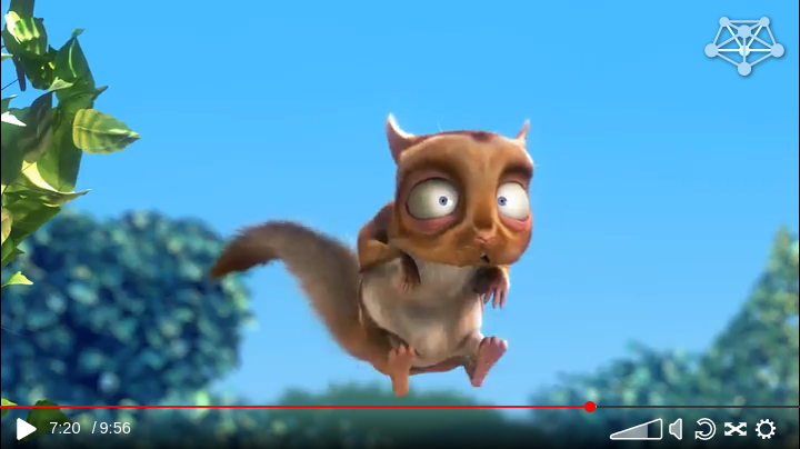
To further personalise the player, let's add a logo to the top right of the video.
We can override parts of the way the elements are arranged in the DOM through the structure object. In this case we're looking for the part that's called videocontainer.
It's probably easiest to steal the videocontainer structure from the default skin, and then add the logo to it.
To do this, open the web inspector on a page where the Meta-player is active, go to the console and type MistSkins.default.structure.videocontainer.
You should get this as an answer:
{type: "video"}
That means that the videocontainer structure currently consists of one element, represented by an object with type: "video". It's referring to what we call a blueprint named video, that will return a DOMelement containing the video tag.
We'll want to change the videocontainer to a div, that contains both our logo and the video element. This is how:
MistSkins.step3 = {
  inherit: "step2",
  structure: {
    videocontainer: {
      type: "container",
      children: [
        {type: "video"},
        {
          type: "logo",
          src: "//mistserver.org/img/MistServer_logo.svg"
        }
      ]
    }
  }
}
I'll add some styling to the CSS as well. An element generated by a blueprint will always receive mistvideo-<BLUEPRINT TYPE> as a class.
.mistvideo-logo {
  position: absolute;
  width: 10%;
  top: 1em;
  right: 1em;
  filter: drop-shadow(#000a 1px 1px 2px) brightness(1.2);
}
And tadaa, here's the logo!
4) Change the structure
There's a bunch of buttons on the control bar, some of which might not make sense for the video's you're streaming. Let's clean it up a bit!
This time we'll need to adapt the controls structure. This one is quite a bit more complicated than the videocontainer one..
Let's retrieve the default one again. To get something copy-paste-able, use this:
JSON.stringify(MistSkins.default.structure.controls,null,2)
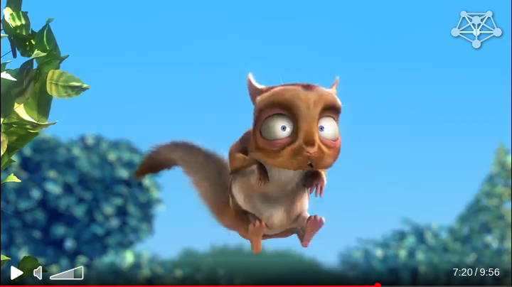
I've put the progress bar at the bottom as it was floating around in mid air a little,
I've moved the currentTime and totalTime blueprints to the right of the control bar, the volume control to the left, and I've removed the loop, fullscreen and track switcher controls.
That gives me this:
MistSkins.step4 = {
  inherit: "step3",
  structure: {
    controls: {
      type: "container",
      classes: ["mistvideo-column", "mistvideo-controls"],
      children: [
        {
          type: "container",
          classes: ["mistvideo-main","mistvideo-padding","mistvideo-row","mistvideo-background"],
          children: [
            {
              type: "play",
              classes: ["mistvideo-pointer"]
            },
            {
              type: "container",
              children: [
                {
                  type: "speaker",
                  classes: [
                    "mistvideo-pointer"
                  ],
                  style: {
                    "margin-left": "-2px"
                  }
                },
                {
                  type: "container",
                  classes: [
                    "mistvideo-volume_container"
                  ],
                  children: [
                    {
                      type: "volume",
                      mode: "horizontal",
                      size: {
                        height: 22
                      },
                      classes: [
                        "mistvideo-pointer"
                      ]
                    }
                  ]
                }
              ]
            },
            {
              type: "container",
              classes: ["mistvideo-align-right"],
              children: [
                {type: "currentTime"},
                {type: "totalTime"}
              ]
            }
          ]
        },
        {
          type: "progress",
          classes: ["mistvideo-pointer"]
        }
      ]
    }
  }
};
The player now looks like this:
5) Changing an icon
But we can do more than just moving elements around. We can also change the way something looks. Let's say we want to change the way the volume is displayed to a simple horizontal slider with a circle.
The volume blueprint constructs the element from the icon library. It can be overridden like this:
MistSkins.step5 = {
  inherit: "step4",
  icons: {
    volume: {
      size: {
        width: 100,
        height: 50
      },
      svg: `
        <rect y="21" width="100%" height="15%" fill-opacity="0.5" class="backgroundFill"/>
        <rect y="21" width="50%" height="15%" class="slider horizontal fill"/>
        <g transform=translate(10,0)>
          <svg width="50%" height="100%" class="slider horizontal">
            <g transform=translate(-10,0)>
              <circle cx="100%" cy="25" r="10" class="fill"/>
            </g>
          </svg>
        </g>
      `
    }
  }
};
It now contains a full length black rectangle.
On top of that, there's another rectangle with the class "slider horizontal". The volume blueprint will change the width of this element to display the volume level.
Lastly, there's a nested svg containing the circle marking the end of the volume level indicator.
Because the tooltip is rather big for this more minimalistic volume bar, I've added some CSS rules to our file:
.mist.icon .backgroundFill {
  fill: $background;
}
.mistvideo-volume .mistvideo-tooltip {
  bottom: auto !important;
  top: -2.5px !important;
  left: 2.5px !important;
  font-size: 0.8em;
  padding: 0;
  background: none;
}
.mistvideo-volume .mistvideo-tooltip .triangle {
  display: none;
}
Now, our player looks like this:

6) Using a hoverWindow blueprint
The last thing I'm not happy with is that the volume slider is always visible. There's really no need, it's okay if it only shows up when the cursor is above the speaker icon.
To achieve that, we can put the volume slider inside a blueprint that's called a hoverWindow. The hoverWindow accepts a structure object as a 'button'. When the cursor hovers over that element, the structure object that's defined as the 'window' is shown.
MistSkins.step6 = {
  inherit: "step5",
  structure: {
    controls: {
      type: "container",
      classes: ["mistvideo-column", "mistvideo-controls"],
      children: [
        {
          type: "container",
          classes: ["mistvideo-main","mistvideo-padding","mistvideo-row","mistvideo-background"],
          children: [
            {
              type: "play",
              classes: ["mistvideo-pointer"]
            },
            {
              type: "hoverWindow",
              mode: "right",
              transition: {
                show: "opacity: 1",
                hide: "opacity: 0",
                viewport: "overflow: hidden"
              },
              classes: ["mistvideo-volume_container"],
              button: {
                type: "speaker" //mute/unmute button
              },
              window: {
                type: "volume", //volume slider
                mode: "horizontal",
                size: {height: 22}
              }
            },
            {
              type: "container",
              classes: ["mistvideo-align-right"],
              children: [
                {type: "currentTime"},
                {type: "totalTime"}
              ]
            }
          ]
        },
        {
          type: "progress",
          classes: ["mistvideo-pointer"]
        }
      ]
    }
  }
};
All done! The player now looks like this:

Conclusion
I hope that's shown you just how customizable our Meta-player is. Did you get ideas for your own projects? We'd love to see what you've made! Also feel free to contact us if there's something you're stuck on which you can't find in the manual, or if you have any suggestions.
Bye for now, and see you next time!
 MistServer